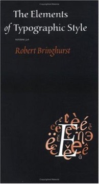
The Elements of Typographic Style
Robert Bringhurst's book on typography as a craft with a history and an ethic — part manual, part reference, written in prose that treats setting type as an act of respect toward the text.
- First published
- 1992
- Publisher
- Hartley & Marks Publishers
- Pages
- 350
- Shelf
- Design
- Level
- Deep
- ISBN-13
- 9780788164545
Record checked against
Catalogue note
- Reads as
- ReferenceBuilt to be consulted rather than read straight through.
- Level
- Advanced / AdvancedAssumes you have read around the subject already.
- Approach
- Practical
- Written for
- Designers and makers, Specialists and serious readers
- Ideas
Saved in this browser only — no account, nothing sent anywhere. My library
Read this if
- You care why some things are obvious to use and others are not.
- You want something to keep nearby and return to, rather than read once.
- You have read around this already and want a book that assumes it.
Its position
Widely regarded as the standard modern work on typography, and unusual in being written by a poet and translator rather than a designer or typefounder.
That origin shapes it. Bringhurst's central claim is that typography exists to honour the content, and his measure of a setting is whether it serves the text rather than whether it looks contemporary.
Typography exists to honour content. The measure is whether the setting serves the text.
Devmark’s reading — not a quotation from the book
The rhythm and proportion chapter
His treatment of the horizontal and vertical structure of a page: the choice of measure, the setting of leading, the handling of space between words and between paragraphs.
His practical guidance — a measure of roughly 45 to 75 characters for continuous text, with 66 as a satisfactory average, and leading chosen in relation to that measure rather than by a fixed ratio — is the most-cited material in the book and the part working designers use daily.
Harmony and counterpoint
His treatment of combining faces, weights and sizes, and of when typographic contrast is doing work and when it is noise.
His preference is for a small number of related variations over a large number of unrelated ones, and his examples of a single family used across an entire complex document are the argument in practice.
Structural forms and devices
The reference core: how to set headings, quotations, notes, lists, tables, captions, folios and running heads, with attention to the cases most manuals ignore.
His insistence that these are structural rather than decorative decisions — that a block quotation is a change in the text's voice and should be set as one — is the frame that makes the specifics cohere.
Analphabetic symbols
His chapter on the marks that are not letters: dashes, quotation marks, ellipses, ligatures, spacing around punctuation, and the distinctions between hyphen, en dash and em dash.
This is the section most responsible for the book's reputation for pedantry, and also the one that most improves a designer's output, because these details are where amateur typography reveals itself.
Choosing and combining type
His approach: choose faces with a purpose suited to the text, its period and its content, rather than by fashion — and understand what a face was designed to do before deploying it.
His discussion of historical classification is genuinely useful context rather than antiquarianism, because it explains why certain faces work for certain texts.
The specimen section
A substantial appendix of type specimens with historical and technical notes on each, together with a glossary and a list of foundries.
It has dated more than the rest of the book, since the type market has changed completely since it was written, but the descriptive vocabulary it teaches has not dated at all.
The prose
It is written with unusual care and frequently borders on the aphoristic. His comparison of typography to music and to gardening, and his framing of the page as a shape with proportion and a history, are what make it readable rather than merely consultable.
Some readers find this precious. Others consider it the reason the book survived while contemporaneous manuals did not.
Some readers find the prose precious. Others think it is why the book survived and the manuals did not.
Devmark’s reading — not a quotation from the book
Where it is limited
It is a book about the printed page. Its treatment of screen typography is minimal and now dated, and it does not address responsive text, variable fonts, rendering differences, or the accessibility requirements that govern digital text.
Its canon is also firmly Latin-script and European, and readers working in other writing systems will find it incomplete in ways it does not acknowledge.
What to take from it
The measure-and-leading relationship, which is the single highest-leverage typographic decision and the one most frequently made by default.
And the ethic: that typographic choices are in service of a text that existed before them, which is a useful corrective to treating type as a branding surface.
What to take away
- 0145 to 75 characters, 66 as a meanThe measure for continuous text, with leading chosen in relation to it rather than by a fixed ratio.
- 02Typography serves the textThe measure of a setting is whether it honours content, not whether it looks current.
- 03Fewer, related variationsContrast should be doing work; a small family used well beats a collection of unrelated faces.
- 04The small marks reveal the amateurDashes, quotation marks, spacing and ligatures are where untrained typography shows itself.
- 05It is a book about paperScreen typography, responsive text and accessibility are outside its scope and must come from elsewhere.