Universal Principles of Design
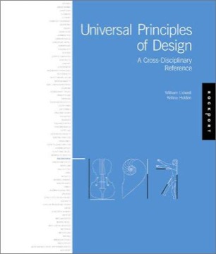
Lidwell, Holden and Butler's reference of design principles — one concept per spread, drawn from psychology, ergonomics, engineering and design, each with an explanation and worked examples.
- First published
- 2003
- Publisher
- Rockport Publishers
- Pages
- 216
- Shelf
- Design
- Level
- Core
- ISBN-13
- 9781592530076
Record checked against
Only one source carried a publication date for this work, so the year is uncorroborated.
Catalogue note
- Reads as
- ReferenceBuilt to be consulted rather than read straight through.
- Level
- Core / BuildingAssumes general familiarity with the subject.
- Approach
- Practical
- Written for
- Designers and makers, Readers with some grounding
- Ideas
Saved in this browser only — no account, nothing sent anywhere. My library
Read this if
- You care why some things are obvious to use and others are not.
- You want something to keep nearby and return to, rather than read once.
- You know roughly how the subject works and want the fuller account.
What it is
A reference book rather than an argument. Each principle occupies a two-page spread: a definition, an explanation of the underlying mechanism, examples and a short reading list.
Later editions expanded the count considerably, and the entries are arranged alphabetically rather than thematically, which makes it a lookup tool rather than a course. It is designed to be opened at random or consulted on a specific question.
Alphabetical, one concept per spread. It is built for lookup, not for reading through.
Devmark’s reading — not a quotation from the book
The range of sources
Its principles come from several disciplines that rarely appear together: cognitive psychology (chunking, the serial position effect), perception (figure-ground, closure, similarity), human factors (Fitts's law, Hick's law), engineering (redundancy, factor of safety) and design practice (modularity, consistency).
The breadth is the book's distinguishing feature, because a designer is unlikely to encounter Fitts's law and the aesthetic-usability effect and the Baby-Face Bias in any other single source.
The principles that earn the most use
A working subset recurs constantly in interface work: Fitts's law on target size and distance, Hick's law on choice and decision time, progressive disclosure, chunking, constraint, feedback, the proximity and similarity grouping principles, and recognition over recall.
These have the strongest empirical support and the most direct application, and a reader who learned only these would have most of the practical value of the book.
Principles that are weaker than presented
This needs stating, because the uniform format gives every entry the same apparent authority. Several entries rest on small, dated or poorly-replicated studies, and some — the ones drawn from social psychology in particular — come from the literature most affected by the replication crisis.
Hick's law holds under narrower conditions than the entry implies. Some aesthetic and bias entries are considerably less settled than a two-page treatment can convey. The format cannot express confidence levels, and that is its main structural weakness.
The uniform format gives every entry equal authority, and the entries are not of equal reliability.
Devmark’s reading — not a quotation from the book
How the examples work
Each principle is illustrated with a designed object — signage, a product, an interface, an aircraft cockpit, a poster — chosen to make the mechanism visible rather than to prove it.
The illustrations are the book's real teaching device, because a principle stated abstractly is forgettable and a principle attached to a memorable object is not.
Its value as shared vocabulary
Its most underrated use is giving a team common names for things everyone half-knows. A critique in which someone can say this violates proximity, or this is a recognition problem rather than a layout problem, is faster and less personal than one conducted in preferences.
Named concepts also make disagreements about design resolvable, because two people arguing about a principle can consult evidence in a way that two people arguing about taste cannot.
How to actually read it
Not front to back. The recommended approaches are consulting it against a live problem, reading a few spreads at a time over a long period, or using the index to find the name for something already noticed.
Read continuously it becomes numbing, because the format that makes each entry scannable also makes a hundred of them undifferentiated.
Where it does not reach
It is a catalogue of components, not a method. It will not help with what to design, how to decide between principles that conflict, how to run a process, or how to work with people.
It also treats each principle in isolation, and real design decisions almost always involve two or more of them pulling in different directions — which is exactly where judgement is required and where the book is silent.
The editions
Successive editions added principles and updated examples, with the most recent substantially larger than the original.
The additions are uneven in quality, and the earlier, tighter editions are arguably the better books, though the newer ones include more material relevant to digital interfaces. Anyone buying a copy should decide on that basis rather than assuming the most recent is the most useful, since the core set of principles has not changed between them.
What to take from it
Use it as a dictionary rather than a textbook: the value is having a name and a mechanism available at the moment you need one.
And read every entry as a starting point with a reading list attached rather than as a settled finding, because the format's uniformity conceals real differences in how well each principle is established.
What to take away
- 01It is a dictionary, not a courseConsult it against a live problem; read end to end it becomes undifferentiated.
- 02The interface subset carries most of the valueFitts, Hick, chunking, progressive disclosure, proximity and recognition-over-recall recur in nearly every project.
- 03Named principles make critique resolvableTwo people arguing about proximity can consult evidence; two people arguing about taste cannot.
- 04The format cannot express confidenceWell-replicated findings and shaky ones get identical spreads, which is the book's structural weakness.
- 05It is silent where principles conflictReal decisions involve several pulling against each other, which is precisely where judgement is needed.