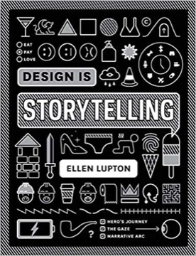
Design Is Storytelling
Ellen Lupton's short, illustrated argument that narrative structure is a working design tool — for products, interfaces, exhibitions and brands — rather than a metaphor.
- First published
- 2017
- Publisher
- Editorial Gustavo Gili S.L.
- Pages
- 160
- Shelf
- Design
- Level
- Core
- ISBN-13
- 9781942303190
Record checked against
Only one source carried a publication date for this work, so the year is uncorroborated.
Catalogue note
- Reads as
- PracticalWritten to be applied, not only understood.
- Level
- Core / BuildingAssumes general familiarity with the subject.
- Approach
- Practical
- Written for
- Designers and makers, Readers with some grounding
Saved in this browser only — no account, nothing sent anywhere. My library
Read this if
- You care why some things are obvious to use and others are not.
- You want to be understood the first time.
- You make things, and want to understand the work rather than wait for inspiration.
- You want something to apply, not only something to think about.
- You know roughly how the subject works and want the fuller account.
The argument
Lupton, a curator at Cooper Hewitt and a designer, imports narrative theory directly: the story arc, the hero's journey, the rule of three, character, emotion and point of view are treated as instruments a designer picks up.
Her claim is that design already tells stories whether or not the designer intends it, and that doing it deliberately is the difference between a sequence and an experience.
Design tells a story whether or not you meant it to. The choice is whether you decide which one.
Devmark’s reading — not a quotation from the book
What is in it
Short chapters, heavily illustrated, on action and the arc; on emotion and Norman's three levels of processing; on co-creation; on scenarios and journey maps; on the rule of three and gestalt.
Each chapter ends with an exercise, and the exercises are practical enough to run in a workshop.
How to use it
It is a designer's handbook rather than a theoretical text — closer to a deck of tools than an argument that builds.
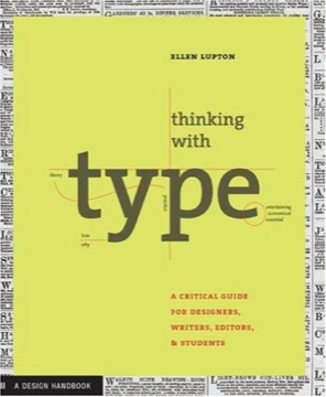
Read alongside Lupton's Thinking with Type for the typographic side. This one is about sequence and emotion; that one is about the letterform.
Closer to a set of tools than to a continuous argument, and better for it.
Devmark’s reading — not a quotation from the book
What it argues against
The implicit target is design taught as composition: layout, hierarchy and visual system, with the user's experience over time treated as someone else's problem.
Lupton's counter is that almost every artefact is encountered as a sequence rather than as an image — you arrive, you look, you act, you leave with an impression — and that a designer who has not decided the shape of that sequence has still determined it, accidentally.
Three parts
Lupton organises the book as action, emotion and sensation — what happens, how it feels, and what the eye actually does. The sequence is deliberate: she starts with narrative structure because it supplies the sense of progression that static composition cannot, then adds affect, then the perceptual mechanics that deliver both.
The arc applied to an interface
Her most useful import is treating a product's use as a sequence with rising tension and resolution rather than as a set of screens. Setup, complication, crisis and resolution map onto onboarding, difficulty, error and recovery, and naming them makes it obvious when a design has a middle with nothing in it.
Three levels of response
The emotion section uses the established distinction between the immediate sensory reaction to how something looks, the response to how it behaves in use, and the later reflective judgement about what owning or using it says. Lupton's point is that designers optimise the first, are measured on the second, and are remembered on the third.
The look is judged in a second. The behaviour is judged for a year. The meaning is judged afterwards.
Devmark’s reading — not a quotation from the book
Gaps
She draws on the well-established account of the two gulfs a user crosses — working out how to do the thing, and working out whether it worked — and treats each as a narrative problem of information supplied at the wrong moment. Framed that way, most usability failures become failures of storytelling rather than of layout.
The exercises
Each chapter ends with a task: storyboard the sequence, write the scenario, map the journey, describe the emotional arc. They are designed to be done in a workshop rather than read, and the book is substantially less useful to someone who skips them, since the theory is thin by design and the exercises carry the content.
Where it is thin
It is short and deliberately broad, borrowing from narrative theory, cognitive psychology and gestalt perception without developing any of them. Readers wanting depth in any one area will find it introductory, and the heavy illustration that makes it approachable also means a low ratio of argument to page.
What to take from it
Use it as a workshop handbook rather than a text. Its lasting contribution is the reframe from composition to sequence — asking what happens next, and what the person knows at each point, rather than only what the screen looks like — which is a question layout training does not teach.
What to take away
- 01Narrative as a toolArc, character and point of view used directly in design work.
- 02Unintended storiesEvery artefact narrates; the only question is whether deliberately.
- 03Three levelsNorman's visceral, behavioural and reflective processing, applied.
- 04Exercises that workEach chapter ends with something runnable in a workshop.
- 05A handbookTools rather than theory, and it does not pretend otherwise.