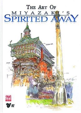
The Art of Spirited Away
The production art book for Miyazaki's 2001 film, collecting concept sketches, background paintings, character designs and the director's own notes.
- First published
- 2002
- Publisher
- VIZ Media LLC
- Pages
- 240
- Shelf
- Anime
- Level
- Entry
- ISBN-13
- 9781569317778
Record checked against
Only one source carried a publication date for this work, so the year is uncorroborated.
Catalogue note
- Reads as
- ReferenceBuilt to be consulted rather than read straight through.
- Level
- Accessible / FoundationalNo prior reading assumed.
- Approach
- Practical
- Written for
- Readers of comics, and anyone curious how the form works, Newcomers to the subject
Saved in this browser only — no account, nothing sent anywhere. My library
Read this if
- You care why some things are obvious to use and others are not.
- You make things, and want to understand the work rather than wait for inspiration.
- You want something to keep nearby and return to, rather than read once.
- You are starting from scratch here and want a way in that assumes no prior reading.
What it is
A collected volume of production material from Spirited Away: initial image boards, character design sheets, colour scripts, finished background paintings and storyboard extracts, arranged roughly in production order.
It includes Miyazaki's written proposal for the film and a substantial amount of commentary from the staff who made it.
The film taken apart into the drawings it was assembled from.
Devmark’s reading — not a quotation from the book
The proposal
Miyazaki's original pitch document is reproduced, and it states the film's intentions plainly: a story for ten-year-old girls, about a child who is not special, in a world that requires work.
It is the single most useful item in the book, and it demonstrates how much of the finished film was determined before any drawing began.
Image boards
The earliest material consists of loose colour sketches establishing mood and place rather than plot, which is how Miyazaki's films are typically begun.
The distance between these and the finished film is instructive: several of the strongest images survive almost unchanged while entire settings were discarded.
Backgrounds
The background paintings are reproduced large and are the book's main visual attraction, particularly the bathhouse interiors and the flooded railway.
Background art of this quality is rarely reproduced at reasonable size, and seeing it without characters in front of it changes how the film reads afterwards.
Character design
Design sheets show the iterations behind each figure, including versions of No-Face and Yubaba that were substantially different.
The sheets also demonstrate the practical function of design in animation: a character must be drawable from every angle by many hands and remain consistent. The sheets for the bathhouse workers in particular show how much variation was needed to populate crowd scenes while keeping the whole legible.
Colour scripts
The colour design material shows how the film's palette shifts across its running time, which is a decision most viewers register without noticing.
The bathhouse's warm interiors against the cold exteriors are planned explicitly, and seeing the plan makes the intention legible. The material also shows several palettes that were tested and abandoned, which is more informative than the finished scheme on its own would be.
Staff commentary
Contributions from the art director, colour designer and animation directors explain specific technical problems and how they were solved.
The commentary is where the book's information density is highest, and it is more useful than the director's own notes in several places. The art director's notes on painting water in particular explain a technical problem that recurs across the film and that a viewer never consciously registers.
Production context
The book documents the film's difficult schedule and the decision to change the story substantially during production.
Ghibli's working conditions during this period were demanding, and the material touches on that without dwelling on it. The film was in production while the studio was also managing its international profile, and the pressure on the schedule is visible in the material that was cut.
As an object
The English edition is a large hardcover with good reproduction, and the printing is a substantial part of the value.
Art books of this kind live or die on paper and colour fidelity, and this one is well produced. It is also large enough that the double-page background reproductions work properly, which smaller art books of this kind frequently fail at.
What it is not
It is not a critical study and contains no sustained interpretation of the film's meaning.
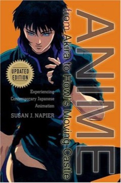
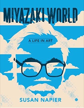
Readers wanting analysis should go to Napier. This book answers how the film was made rather than what it is about. It is also not a complete production record, and a number of sequences are represented thinly or not at all, presumably for reasons of space.
The series
Comparable volumes exist for most Ghibli features, and the quality is generally consistent across them.
This is among the better ones, partly because the film's design problems were unusually complex and generated correspondingly interesting development material. The Princess Mononoke volume is its closest comparison and is also strong, and readers who find this one useful should look at that one next.
Who it is for
Readers who work in animation, illustration or design, and readers who want to understand how a film of this kind is actually constructed.
It is a reference and a visual pleasure rather than a book to read through, and it rewards being kept where it can be opened at random.
What to take away
- 01The proposal determined the filmMiyazaki's pitch — a story for ten-year-olds about an unremarkable child in a world requiring work — states nearly everything in advance.
- 02Mood before plotThe earliest material is loose colour sketches establishing place, which is how these films are typically begun.
- 03Backgrounds seen without charactersReproducing the paintings without figures in front of them changes how the film reads afterwards.
- 04Design as a practical constraintA character must be drawable from every angle by many hands, which the design sheets make visible.
- 05Palette planned explicitlyThe warm bathhouse against cold exteriors is a deliberate colour script, not an emergent property.
- 06How, not whatThe book documents construction and contains no interpretation, which is a division of labour worth knowing before buying.