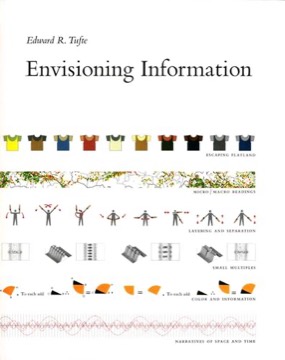
Envisioning Information
Edward Tufte's second volume, on the central problem of the field — representing a multidimensional world on a flat surface — and the design strategies that make density legible rather than confusing.
- First published
- 1990
- Publisher
- Graphics Press
- Pages
- 126
- Shelf
- Design
- Level
- Deep
- ISBN-13
- 9780961392116
Record checked against
Catalogue note
- Reads as
- PracticalWritten to be applied, not only understood.
- Level
- Advanced / AdvancedAssumes you have read around the subject already.
- Approach
- Practical
- Written for
- Designers and makers, Specialists and serious readers
- Ideas
Saved in this browser only — no account, nothing sent anywhere. My library
Read this if
- You care why some things are obvious to use and others are not.
- You want something to apply, not only something to think about.
- You have read around this already and want a book that assumes it.
The problem it takes up
Tufte states it directly: the world is complex and multivariate, and paper and screens are flat. All information design is the work of escaping flatland.
Where the first book was about statistical honesty, this one is about density — how much can be shown at once, and what makes the difference between rich and cluttered.
All information design is the work of escaping flatland. That is the whole problem, stated once.
Devmark’s reading — not a quotation from the book
Escaping flatland
His opening argument and title theme. His examples run from maps and timetables to dance notation and musical scores — forms that encode several dimensions in two without apology.
His point is that the successful ones do not simplify the data; they design the surface so that more dimensions become readable.
Micro and macro readings
His most valuable idea. A well-designed dense display supports two readings simultaneously: an overall pattern visible at a glance, and detail available on close inspection, with no separate legend or drill-down required.
His examples — the Vietnam Veterans Memorial, detailed maps, transport diagrams — show that detail does not destroy the overview when the design is right. The common belief that clarity requires removing detail is what he is arguing against.
Layering and separation
His treatment of how to make elements distinguishable without making them loud: subtle differences in value, weight and colour rather than boxes, bold rules and strong contrast.
His principle — that the smallest effective difference should be used for every visual distinction — is the single most portable rule in the book and applies to interface design as directly as to print.
Use the smallest effective difference. Every visual distinction should be as quiet as it can be and still work.
Devmark’s reading — not a quotation from the book
Small multiples again
Developed further than in the first volume, with more examples and more attention to how the repeated frame should be constructed.
His argument that the design of the individual panel is amortised across every panel — so effort spent on it pays back many times — is a practical point that the first book left implicit.
Colour and information
His chapter on colour draws on Albers and on cartographic practice. Its core recommendations: use colour to label, to measure, to represent reality, and to enliven — in that order of difficulty.
His practical rule, borrowed from mapmakers, is to place bright colours sparingly on a quiet background of grey, blue-grey or beige, rather than letting strong hues compete across the whole surface.
Narratives of space and time
His treatment of displays that encode motion or sequence: train timetables, dance notation, the storyboards of film, scientific diagrams of process.
His interest is in how a static surface can convey change, which is the problem every timeline and every process diagram faces. His examples show that the successful ones encode time as a spatial dimension and hold it consistent, so that distance along an axis always means the same duration, rather than letting sequence drift into a loose left-to-right convention.
The production
Like its predecessor it is self-published and produced to an unusual standard, with colour printing and paper chosen for the reproductions.
This matters because much of the argument is about fine visual distinctions that a cheaply printed book could not demonstrate. The object is part of the evidence.
Where it is limited
Almost entirely print-oriented. It has nothing to say about interaction, which is the primary tool modern designers use to handle density, and it does not address the accessibility consequences of relying on subtle value differences.
Its examples also skew historical and European, and the analysis is consistently aesthetic rather than empirical.
What to take from it
The smallest effective difference, which is the rule that most reliably improves an interface when applied consistently.
And the micro/macro principle, which is the direct answer to the reflex of hiding detail behind a click — the detail can frequently stay, if the design earns it.
What to take away
- 01Escaping flatland is the whole problemA multivariate world on a two-dimensional surface, which is what every information display is attempting.
- 02Micro and macro at onceA dense display can show both pattern and detail, so clarity does not require removing information.
- 03Smallest effective differenceEvery visual distinction should be as quiet as it can be while still doing its job.
- 04Bright colour on a quiet groundThe cartographic rule: small areas of strong hue against grey, blue-grey or beige.
- 05The panel design is amortisedIn small multiples, effort spent on the single frame pays back across every repetition.