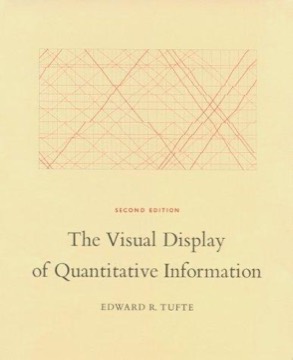
The Visual Display of Quantitative Information
Edward Tufte's foundational treatment of statistical graphics — what makes a chart tell the truth, what decoration costs, and why the best displays give the largest number of ideas in the smallest space with the least ink.
- First published
- 1983
- Publisher
- Graphics Press
- Pages
- 197
- Shelf
- Design
- Level
- Deep
- ISBN-13
- 9780961392109
Record checked against
Catalogue note
- Reads as
- FoundationThe standard first book on its subject.
- Level
- Advanced / AdvancedAssumes you have read around the subject already.
- Approach
- Balanced
- Written for
- Designers and makers, Specialists and serious readers
- Ideas
Saved in this browser only — no account, nothing sent anywhere. My library
Read this if
- You care why some things are obvious to use and others are not.
- You want the book people are sent to first on this subject.
- You have read around this already and want a book that assumes it.
What the book is
A designed object as much as an argument. Tufte self-published it because no publisher would produce it to his specification, and the result — wide margins holding figures beside the text they discuss, careful paper, no plates section — is itself a demonstration of the thesis.
Its subject is the graphical display of measured quantities, and its claim is that this is a form of reasoning rather than illustration.
He self-published because no publisher would produce it to specification. The object argues the thesis.
Devmark’s reading — not a quotation from the book
Graphical excellence
His definition: the well-designed presentation of interesting data, giving the viewer the greatest number of ideas in the shortest time with the least ink in the smallest space.
Each clause does work. Interesting data comes first — no design rescues an uninteresting measurement. And the criterion is ideas conveyed, not impressions made, which rules out a great deal of what is produced as visualisation.
Graphical integrity and the lie factor
His measure of distortion: the size of an effect shown in the graphic divided by the size of the effect in the data. A truthful chart has a lie factor of one.
His examples of published charts with lie factors of five or more, and his principles — that the representation should be proportional to the quantity, that the scale should be labelled, that context should not be truncated — remain the clearest available statement of graphical honesty.
Data-ink ratio
His most quoted and most argued-over concept: the proportion of a graphic's ink devoted to data that cannot be erased without losing information.
His prescriptions follow — maximise the ratio, erase non-data ink, erase redundant data ink, revise and edit. His redesigned box plots and stripped bar charts are the demonstration, and they are austere enough that many designers consider him to have overshot.
Chartjunk
His term for decoration that carries no information: moiré vibration, heavy grids, unnecessary three-dimensional effects, decorative patterns inside bars.
The concept named something the field had no word for, and the naming mattered more than the specific examples. His objection is not to beauty but to ornament that competes with the data for attention.
The objection is not to beauty. It is to ornament that competes with the data for the reader's attention.
Devmark’s reading — not a quotation from the book
Small multiples
His preferred device: the same graphical design repeated across a dimension, so comparison happens by eye across a grid rather than by memory across pages.
His argument that this is the natural design for multivariate data, and that it exploits the reader's ability to make visual comparisons far faster than numerical ones, is the book's most practically useful recommendation.
The historical examples
Playfair's invention of the time-series and bar chart, Minard's figurative map of Napoleon's Russian campaign, Snow's cholera map, the Japanese train schedule.
The Minard chart in particular — six variables on a flat surface, with the army's dwindling width as its emotional core — carries much of the book's persuasive weight, and Tufte's judgement of it as possibly the best statistical graphic ever drawn is the line most often quoted from him.
Where the criticism has force
Empirical work on graph comprehension has not consistently supported maximising the data-ink ratio. Some studies have found that certain embellishment aids recall and does not impair accuracy, and that extremely minimal charts can be harder to read.
Tufte's position is aesthetic and normative as much as empirical, and it is fairer to treat his principles as a strong default than as findings.
How to use it now
Most of what it argues predates interactive and screen-based visualisation, and the book does not address interaction, animation, colour on displays, or accessibility at all.
The principles transfer — integrity, comparison, density, the suspicion of ornament — but a reader looking for guidance on building a dashboard will need to supply the translation themselves.
What to take from it
The lie factor, because it converts an argument about whether a chart is misleading into a calculation.
And small multiples, because it is the single most underused layout in practice and it solves the comparison problem that most dashboards solve badly with filters and toggles.
What to take away
- 01Above all else, show the dataHis own summary line, and the test almost every failed chart fails.
- 02The lie factor is measurableEffect shown divided by effect in the data, which turns a dispute about honesty into arithmetic.
- 03Small multiples beat sequenceRepeating one design across a grid lets the eye compare, which is far faster than comparing from memory.
- 04Chartjunk needed a nameNaming decoration that carries no information did more for the field than any single prescription.
- 05The empirical support is partialStudies have not consistently backed maximising data-ink, so treat the principles as a strong default.