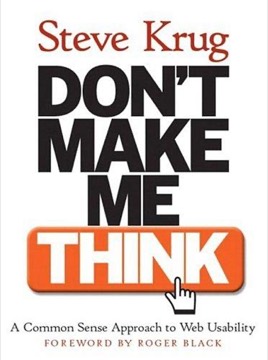
Don't Make Me Think
Steve Krug's short, practical book on web usability, built on one rule — a page should be self-evident — and on the observation that people do not read pages, they scan them and click the first thing that looks approximately right.
- First published
- 2000
- Publisher
- New Riders Press
- Pages
- 201
- Shelf
- Design
- Level
- Entry
- ISBN-13
- 9780321965516
Record checked against
Catalogue note
- Reads as
- PracticalWritten to be applied, not only understood.
- Level
- Accessible / FoundationalNo prior reading assumed.
- Approach
- Practical
- Written for
- Designers and makers, Newcomers to the subject
- Ideas
Saved in this browser only — no account, nothing sent anywhere. My library
Read this if
- You care why some things are obvious to use and others are not.
- You want something to apply, not only something to think about.
- You are starting from scratch here and want a way in that assumes no prior reading.
The first law
Krug's rule is the title: don't make me think. Anything on a page that causes a moment of hesitation — what is this, where do I click, is this clickable — is a small tax, and the taxes accumulate into abandonment.
The standard is self-evidence. A page should be understood without explanation, and where that is impossible, self-explanatory is the acceptable fallback. Everything else in the book is a technique for reaching one of the two.
Every moment of hesitation is a small tax. People abandon pages by accumulation, not by decision.
Devmark’s reading — not a quotation from the book
How people actually use pages
The book's foundational observation, from watching real users: nobody reads. People scan for something that looks like what they want, satisfice by clicking the first plausible option rather than the best one, and muddle through with an incorrect mental model that works well enough.
Krug's point is that this is not laziness — it is a rational strategy for a medium where the cost of a wrong click is a back button. Designing for the careful reader is designing for someone who does not exist.
Billboard design
Since people scan, pages should be built like billboards passed at speed. Establish a clear visual hierarchy so importance is visible before anything is read; use conventions rather than inventing; break pages into clearly defined areas; make clickable things obviously clickable; and minimise noise.
The argument for conventions is the one designers resist most. Krug's position is that originality in navigation is almost always paid for by the user, and that the places worth being original are elsewhere.
Omit needless words
Krug's advice on copy is blunt: get rid of half the words on each page, then get rid of half of what's left. Happy talk — the welcoming introductory paragraph nobody reads — and lengthy instructions are the main targets.
The reasoning is the same as everywhere in the book. Text that is skipped is not neutral; it is noise competing with the text that matters.
Navigation as location
A long chapter argues that web navigation replaces the physical sense of place a building gives you. People cannot feel where they are in a site, so the navigation has to tell them explicitly.
Krug's persistent-navigation checklist — site identity, a way to the home page, utilities, sections, and a clear "you are here" indicator — is unglamorous and still correct. His test is that a user dropped on any page should be able to answer what site this is, what page, and what else is here.
Usability testing, demystified
The book's most consequential practical argument is that testing does not have to be a research programme. Testing one user is a hundred per cent better than testing none, and three users in a morning will surface the serious problems.
Krug's method is deliberately cheap: a small number of participants, a simple script, observers watching a stream, and a debrief the same day that picks the few most serious issues. The argument is that a modest test done monthly beats a rigorous one done never.
Three users in a morning, every month, beats a perfect study that never gets scheduled.
Devmark’s reading — not a quotation from the book
The religious debate
Krug's chapter on internal arguments is quietly the most useful for professionals. Teams argue about whether users like drop-downs, or whether people scroll, as though these have universal answers.
His point is that these questions are unanswerable in general and trivially answerable for your specific site by watching three people use it. Reframing opinion disputes as testable questions is the fastest way out of a design argument, and it works.
Accessibility and goodwill
Later editions add a chapter making the case for accessibility in practical rather than compliance terms, with a short list of high-impact fixes rather than an exhaustive standard.
The related idea is the reservoir of goodwill: every user arrives with limited patience, and each obstruction — a forced registration, hidden information, a form that discards input — draws it down. Some sites spend it faster than they earn it.
Where it is dated
The screenshots are of a web that no longer exists, and the mobile chapter added in the third edition is thin relative to how central mobile became. There is nothing here about design systems, component libraries, single-page applications or the patterns those introduced.
It also predates the sharpest current debates — dark patterns, consent interfaces, attention capture — and assumes throughout that the designer wants the user to succeed.
Why it survives
Because the observations are about people rather than technology, and people have not changed. Scanning, satisficing and muddling through describe how anyone uses any interface, and the billboard principles follow from those facts rather than from any platform.
It is also very short and genuinely well written, which means it gets finished. For anyone building interfaces it remains the highest ratio of useful-to-length in the field.
What to take away
- 01Self-evident beats explainedIf a page needs explaining, the explanation is a cost the design should have absorbed.
- 02People satisfice, they do not optimiseThe first plausible option gets clicked, so designing for careful evaluation designs for nobody.
- 03Conventions are paid for by the userOriginality in navigation is almost always spent from someone else's patience.
- 04Test three people, monthlyA cheap recurring test beats a rigorous one that never gets scheduled.
- 05Turn opinions into observationsMost design arguments are unanswerable in general and trivial to settle for your own site.