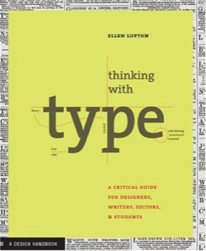
Thinking with Type
Ellen Lupton's working manual of typography, organised as letter, text and grid — a book that teaches the reasoning behind typographic decisions rather than a set of rules, and does so in a form that demonstrates its own argument.
- First published
- 2004
- Publisher
- King Publishing, Laurence
- Pages
- 200
- Shelf
- Design
- Level
- Core
- ISBN-13
- 9781856694247
Record checked against
Only one source carried a publication date for this work, so the year is uncorroborated.
Catalogue note
- Reads as
- ReferenceBuilt to be consulted rather than read straight through.
- Level
- Core / BuildingAssumes general familiarity with the subject.
- Approach
- Practical
- Written for
- Designers and makers, Readers with some grounding
- Ideas
Saved in this browser only — no account, nothing sent anywhere. My library
Read this if
- You care why some things are obvious to use and others are not.
- You want something to keep nearby and return to, rather than read once.
- You know roughly how the subject works and want the fuller account.
What the book is for
Lupton is writing for people who have to set type and have not been formally trained in it: designers, editors, developers, anyone producing documents. Her aim is understanding rather than compliance.
The structure follows scale — letter, then text, then grid — which is also the order in which typographic decisions compound. A decision about the letter constrains what is possible in the text, which constrains the grid.
Organised by scale, because a decision at the letter constrains everything above it.
Devmark’s reading — not a quotation from the book
Letter: the anatomy and the history
The first section covers letterform anatomy — x-height, ascender, descender, counter, stem, terminal — and the historical sequence from humanist through transitional and modern to sans-serif and beyond.
Lupton's point in including the history is practical: a typeface's forms encode the tool and the century that produced them, and knowing which tradition a face belongs to explains how it behaves and what it will pair with.
Type classification, used properly
She is sceptical of classification systems as taxonomy and useful about them as description. What matters is not naming the category but noticing the properties: stroke contrast, axis, aperture, x-height relative to cap height.
Her treatment of what makes a typeface suitable for extended reading versus display is the most immediately applicable material — and the observation that display faces fail at text sizes for reasons visible in the letterform rather than as a matter of taste.
Text: the invisible decisions
The second section covers what most people get wrong: line length, leading, alignment, tracking, and the relationships between them.
Her central insight is that these are not independent. Longer lines need more leading; a larger x-height needs more leading; tighter tracking permits slightly shorter lines. Adjusting one without the others is the commonest source of text that is technically legible and unpleasant to read.
Kerning, tracking and the difference
Lupton is precise where most sources are vague. Kerning adjusts the space between two specific letters; tracking adjusts space uniformly across a run. They solve different problems and are not interchangeable.
Her rule on tracking — that it should generally be increased for all-capitals and small sizes and decreased for large display type — is the single most useful correction for people setting type without training.
Kerning is between two letters; tracking is across a run. They fix different problems.
Devmark’s reading — not a quotation from the book
Marks, errors and the small things
A section of the details that separate competent typesetting from amateur: proper quotation marks rather than primes, en dashes versus em dashes and hyphens, the correct use of italics and small capitals, and why underlining is a typewriter artefact.
Lupton treats these as meaning-bearing rather than pedantic — a prime is a different character with a different job, and using it for an apostrophe is an error rather than a style.
Grid: structure as an argument
The third section covers the golden section, single-column, multi-column, modular and hierarchical grids, with the argument that a grid is a system for making consistent decisions rather than a constraint on creativity.
Her treatment is more pragmatic than the Swiss tradition it descends from, and she is explicit that the grid exists to be departed from deliberately — which is a different thing from not having one.
Type on screen
Later editions substantially expand the digital material, covering responsive type, the relationship between CSS units and typographic measure, and the differences screen rendering introduces.
This is where the book is most obviously a living document rather than a classic, and the reader should check which edition they have. The underlying principles do not change, but the applicable constraints have.
The form demonstrates the argument
The book is itself a piece of typographic design, and it is meant to be examined as one. Specimens, annotated examples and deliberate demonstrations of both correct and incorrect settings appear throughout.
This is more valuable than it sounds: typography is difficult to learn from prose description alone, and seeing the same text set five ways teaches faster than any explanation of why.
How it compares
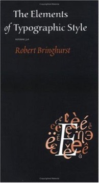
Against Bringhurst's *Elements of Typographic Style* — the field's other standard — Lupton is shorter, more practical, more contemporary, and considerably easier to start with.
Bringhurst is more philosophical, more beautiful and more complete; Lupton is the one you can apply on Tuesday. Most practitioners end up owning both, and most should start here.
What to take away
- 01Text settings are interdependentLine length, leading and x-height constrain each other; adjusting one alone is the usual source of unpleasant text.
- 02Classification describes propertiesThe category name matters less than contrast, axis, aperture and x-height, which predict behaviour.
- 03Track up for caps and small sizesAnd down for large display type — the single most useful correction for untrained typesetting.
- 04A grid exists to be departed fromDeliberate departure from a system is a different thing from having no system.
- 05Learn typography by lookingThe same text set five ways teaches faster than any prose explanation of why.