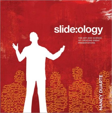
Slide:ology
The Art and Science of Creating Great Presentations
Nancy Duarte's earlier book on the slide itself — the visual craft of presentation design, treating slides as a designed medium with its own grammar rather than as a container for bullet points.
- First published
- 2008
- Publisher
- O'Reilly Media
- Pages
- 295
- Shelf
- Communication
- Level
- Core
- ISBN-13
- 9798341672048
Record checked against
Catalogue note
- Reads as
- PracticalWritten to be applied, not only understood.
- Level
- Core / BuildingAssumes general familiarity with the subject.
- Approach
- Practical
- Written for
- Writers and speakers, Readers with some grounding
- Ideas
Saved in this browser only — no account, nothing sent anywhere. My library
Read this if
- You want to be understood the first time.
- You care why some things are obvious to use and others are not.
- You want something to apply, not only something to think about.
- You know roughly how the subject works and want the fuller account.
Its premise
Duarte's starting position is that slides are a visual medium being used as a text medium, and that almost every failure of business presentation follows from that category error.
Her argument is that a slide is neither a document nor a teleprompter. A document can be dense because the reader controls the pace; a slide cannot, because the audience must absorb it while also listening to a person speak.
A slide is not a document. The reader controls a document's pace and cannot control a slide's.
Devmark’s reading — not a quotation from the book
Creating ideas, not slides
Her opening instruction is to work away from the software: generate ideas on paper or a whiteboard, decide the structure, and only then open the application.
Her reasoning is that presentation software imposes a structure — a title and a bulleted list — before any thinking has happened, and that most presentations are shaped by that default rather than by their content.
Displaying data
Her chapters on charts: choose the form that matches the message, remove everything that does not carry information, and label directly rather than using a legend the audience must decode.
Her most useful instruction is that each data slide should make one point and that the point should be stated in the slide's title as a sentence rather than a label. A chart titled 'Q3 Revenue' asks the audience to find the message; one titled with the message does not.
Thinking like a designer
Her core visual chapters: contrast, flow, hierarchy, unity, white space and the use of a consistent grid across a deck.
Her treatment of white space as an active element rather than waste is the one that most changes the appearance of ordinary business slides, because the reflex to fill the available area is what produces the crowded slide in the first place.
Arranging elements
Her practical layout guidance: alignment, proximity grouping, visual weight, and the use of a small number of consistent positions across a deck so the audience learns where to look.
Her point that consistency reduces the cognitive cost of each new slide is the argument for a template that most teams apply as branding and few apply as function.
Using imagery
Her guidance on photographs and illustration: choose images that carry meaning rather than decorate, use them at a scale that lets them work, and avoid the generic stock vocabulary that signals nothing.
Her warning about images that merely illustrate a word in the title — a handshake for partnership, a mountain for challenge — names the single most common failure in corporate decks.
Movement and build
Her treatment of animation and transition as tools for directing attention and revealing structure, with the explicit condition that they must serve comprehension.
Her rule that a build should reveal a relationship the audience needs to understand in sequence — rather than simply delay text — is the distinction between animation that helps and animation that irritates.
Presentation ecosystem
Her chapters on the wider context: the deck that will be read without a speaker, the handout, the leave-behind, and the different design each requires.
Her insistence that the slide deck and the document are separate artefacts, and that combining them produces something that fails as both, is the argument against the dense slide that most organisations still have not absorbed.
Slides and the document are separate artefacts. Combining them produces something that fails at both jobs.
Devmark’s reading — not a quotation from the book
Where it has dated
The software, the visual style and the examples belong to their period, and the book predates widescreen formats, remote presentation, and the now-dominant practice of decks circulated as documents rather than presented.
Its principles transfer, but a reader will be translating the examples constantly, and its silence on presenting to a camera is a real gap.
Reading it with Resonate
This book covers the visual craft and *Resonate* covers the narrative structure. They were written in that order and are best read in the reverse.
Structure first, slides second, is the sequence Duarte herself argues for, and a reader who reads only this one risks producing beautiful slides in service of a talk that was never designed.
What to take away
- 01Title the slide with the messageA chart labelled 'Q3 Revenue' asks the audience to find the point; a sentence gives it to them.
- 02Leave the software until lastThe default title-and-bullets structure shapes the content before any thinking has happened.
- 03White space is activeThe reflex to fill the available area is what produces the crowded slide.
- 04Builds should reveal relationshipsAnimation that delays text irritates; animation that shows sequence helps.
- 05Separate the deck from the documentAn artefact designed to do both jobs does neither, and most organisations still produce one.